
< Animation1-1 강의 용어 정리>
width = 넓이
height= 높이
background = 색상
border = 테두리 solid= 입체
display flex = 중앙정렬
align-items = 플렉스 요소들의 수직 방향 정령 방식을 설정
justify-content = 플렉스 료소의 수평 방향 정렬 방식을 설정하는것
Keyframe = 애니메이션이 변하는 지점, 방향이 변하는 지점
( # 트렌지션은 중간에 변할수 있는 값이 없었다.)
----------------------------------------------------------------
<예제 1>
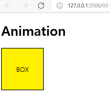
1. 박스를 한개 만들어 주자 단, 박스색은 노란색 , 테두리는 검정색으로
2. 박스안 센터에 box 라는 단어를 넣어주자
<!DOCTYPE html>
<html>
<head>
    <meta charset="UTF-8">
    <meta name="viewport" content="width=device-width, initial-scale=1.0">
    <meta http-equiv="X-UA-Compatible" content="ie=edge">
    <title>Interactive Web</title>
    <style>
    .box {
            display: flex;
            align-items: center;
            justify-content: center;
            width: 100px;
            height: 100px;
            border: 2px solid #000;
            background: #fff000;
            animation: sample-ani 2s linear 3;
        }
    </style>
</head>
<body>
    <h1>Animation</h1>
    <div class="box">BOX</div>
</body>
</html>
<예제 2>
1. 박스에 에니메이션을 넣어보자
2. 노란 박스를 이동해 보도록 하자.
<풀이방식>
@keyframe 으로 애니메이션을 넣어준다. 옆에 프레임의 이름 사용자 방식으로 넣어준다.
0% - 50% - 100% 각각의 움직이는 이동지점 퍼센트를 넣어준다.
각각의 퍼센트 안에 transform 움직일 방향 ( x . y )를 정해준다.
.box 안에 만든 에니메이션 을 넣고 사용자 지정 프레임 이름을 넣어준다 .
<!DOCTYPE html>
<html>
<head>
    <meta charset="UTF-8">
    <meta name="viewport" content="width=device-width, initial-scale=1.0">
    <meta http-equiv="X-UA-Compatible" content="ie=edge">
    <title>Interactive Web</title>
    <style>
        @keyframes sample-ani {
            0% {
                transform: translate(0, 0);
            }
            50% {
                transform: translate(300px, 0);
            }
            100% {
                transform: translate(400px, 500px);
            }
<예제3>
1. 애니메이션을 계속 반복 하고 싶으면box 안 animation 옆에 linear infinite 를 입력한다. 무한 반복
.box {
            display: flex;
            align-items: center;
            justify-content: center;
            width: 100px;
            height: 100px;
            border: 2px solid #000;
            background: #fff000;
            animation: sample-ani 3s linear infinite;
        }
<예제 4>
다른 방식으로도 모양을 자유롭게 움직여 보자
1.linear infiniti > linear 3 : 무한반복에서 3번반복으로 바꾸기
2. 박스 색상 변하게 하기
- 키프레임 안에서 자유롭게 변하게 할수 있다 중간에서 색상을 red 로 변하게 하기
 50% {
                transform: translate(300px, 0);
                background: red;
            }
See the Pen Untitled by 김하은 (@king_coding) on CodePen.
'Class > css' 카테고리의 다른 글
| [ CSS변환 / Transfrom 1-2 ] (0) | 2022.03.30 |
|---|---|
| [ CSS변환 / Transfrom 1-1] (0) | 2022.03.30 |
댓글